Mobile Optimization
What is Mobile Optimization?
 An increasing amount of web traffic is coming from iPhones and Android phones. These devices have small, narrow screens that require a streamlined page layout. Mobile users may also have different needs than regular web visitors. For example a mobile visitor is more likely to want to call you (to tell you they're running 5 minutes late) or get directions to your office. Our sleek mobile optimized websites give mobile users the key features they need.
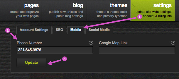
Add a Click to Call Button
To add a click to call button to your mobile home page, go to Settings > Mobile and enter your phone number (including area code).
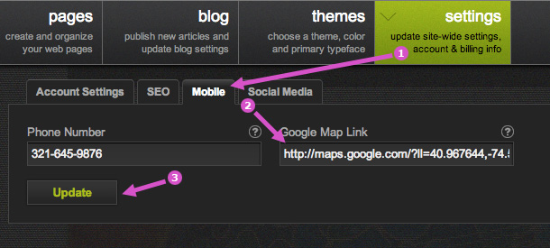
Add a Map & Directions Button
To add a map and directions button to your mobile home page, go to Settings > Mobile and enter the Google Map link to your office. Here's how to get the link:
1. Visit the Google Maps website and search for your office location.
2. Copy the web page address from your web browser's address bar.
3. Paste the web page address into Settings > Mobile and click save.
Advanced Topic: Selectively Show/Hide Content on Mobile
If you're an advanced user, there may be cases where you want to hide some content from mobile phones (or show some content only on mobile phones). You can accomplish this by adding the appropriate class names to your HTML.
Here's the original HTML:
<p>This text will be visible on desktops, tablets, and phones.</p>
Here we hide the paragraph from mobile phones:
<p class="user-mobile-hide">This text won't be visible on phones.</p>
And here we make the paragraph show only on mobile phones, but not desktops or tablets.
<p class="user-mobile-only">This text ONLY shows on mobile phones.</p>