Acupuncture Website Design
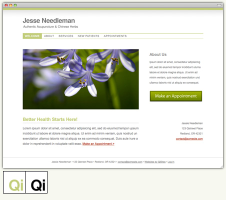
Our latest acupuncture website design features simple, elegant lines. We’ve given this acupuncture website design a horizontal main navigation menu and are introducing this new design in two styles: black and green. The black website is inspired by Japanese and Swedish design, featuring the sharp contrast of black text on a white background, and a deep, rich red as the link color. Our green website design, depicted above, is soft and elegant, evoking the feeling of springtime. Both acupuncture website designs are available immediately through the QiSites website editor.

