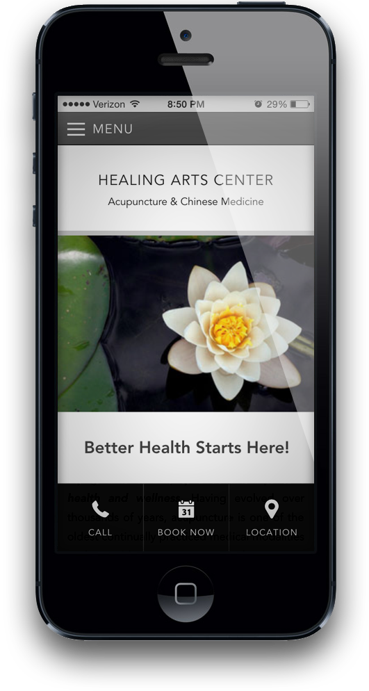
1. Your Website Isn't Mobile-Friendly
Did you know that as much as half of your website traffic is coming from mobile devices these days? If you don't have a mobile-friendly website, you're making it very hard for visitors to engage with your content. A mobile-friendly website will also perform better in search rankings because Google has been expanding its use of mobile-friendliness as a ranking factor since 2015.
You can check if your website is mobile-friendly using Google's Mobile-Friendly Tool.

2. Your Website is Slow
Believe it or not, websites are getting slower and slower. Custom fonts, large images, and analytics scripts are some of the common culprits. Third party content, like YouTube videos and Google maps, will also slow down your pages. But for many acupuncturists, a bad hosting provider or low quality WordPress theme may be to blame.
As you click around your website your pages should generally load in less than 2 seconds. If pages routinely take 4 seconds or more, you're almost certainly losing business, because page load speed has been identified as a major factor in website abandonment.

3. Your Visitors See a Wall of Text
Well-designed web pages make it easy for users to skim, scan, and scroll by using headings, sub-headings, bold, italics, links, and images to create visual hierarchy and visual anchors throughout the page. Visual cues make your pages easier to navigate and more engaging to read. This is especially important on mobile, because it's easy to lose your place when you're scrolling through a long page. Visual structure also makes your content more comprehensible by reinforcing key words and ideas for the reader. As an added benefit, providing structure and emphasis can create more coherent HTML code, which leads to better search engine rankings.

4. Your Navigation is Confusing
An awkward navigation menu is one of the easiest ways to frustrate your visitors. The best approach is to keep it simple. Don't make your visitors think about how to navigate your website. Avoid menu systems that require extra taps or have "creative" approaches like multi-level toggle switches. We also generally prefer menus that don't cover or block the page content and that don't interfere with scrolling the page.
Spot a problem? Fix it!
If you're suffering from any of these problems, don't panic. No website is perfect, so there's always room for improvement. But don't ignore the problems either. Talk to your website provider to find out if your problems are easy to fix. Or check out QiSites for fast loading, mobile optimized, customizable websites.


 An increasing amount of web traffic is coming from mobile devices such as iPhone, Android, and Blackberry phones. Our sleek mobile optimized websites give mobile users the key features they need, while still enabling a full-featured experience for PC and tablet users. Mobile optimization is now included free on all of our websites. Some key features of our mobile ready design: