
In our latest round of theme updates we have redesigned the social media links, giving them a new, unified visual style. We have also increased the size of fonts, widened the main text column, and added more whitespace to the page header area, navigation menu links, and drop down menus. And we added a very subtle fade-in animation effect to the navigation menu, which makes it feel smoother and more elegant.
And be sure to check out the new Banner Page feature!
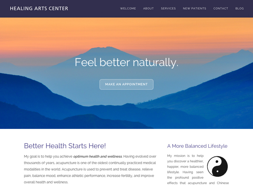
Getting Started with Banner Pages
Many of our themes now support visually stunning full page banner images. You can convert any existing page to a Banner page. Here’s how:
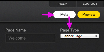
- Click the Meta button.
- Select the Banner Page option from the Page Type menu.
- Click Save. Then click Close
- Click the green Edit bar above the banner to select your image.
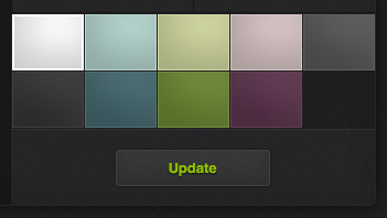
Spring is the perfect time to give birth to a fresh website editing interface. We hope you enjoy the beautiful new graphics and smoother UI interactions (thanks to our move to CSS animations).
We are pleased to announce that we are in the process of renovating our website themes. In keeping with recent web design trends, the renovated themes will have larger fonts and more white space (“white space” is the graphic design term for empty space around page elements). The result will be themes that feel cleaner, more readable, and more welcoming to visitors.
You don’t need to take any action to benefit from these updates. Updated themes will be rolled out over the coming weeks and your website will automatically receive the upgrade!
 The Internal Revenue Service has allowed acupuncture to be deducted as a medical expense since 1973.
Source: Frum, David (2000). How We Got Here: The ‘70s. New York, New York: Basic Books. p. 133. ISBN 0465041957.


 The Internal Revenue Service has allowed acupuncture to be deducted as a medical expense since 1973.